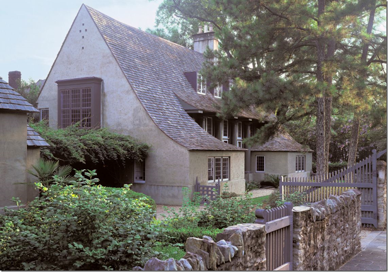
The facade as it was under Bobby McApline: The lush vines hang over a pergola placed between the carriage house and the front door. Today, the vines are totally gone!
Recently, we welcomed Bobby McAlpine as a guest on The Skirted Roundtable where he discussed the first house he built for himself – modeled after Edwin Lutyens famous house Homewood. McAlpine’s house in Montgomery is a favorite of many of his devotees – and many were especially curious to know who lived in that house now and what it looked like today. Bobby obliged us by talking lovingly about the house – how it basically was built for a bachelor, yet it wasn’t until he sold it to an architect at his firm with a wife and two children – did the house truly feel complete. Love was missing when McAlpine lived there alone, and the family living there now completes it. How romantic!
A few weeks ago on Cote de Texas HERE, I showed the Montgomery house as it was designed under Bobby – three different times. The last time, the house was bathed in dark paint and fabrics, representing a time in his life when he wanted to hibernate himself against the world and be protected by the dark paint, which would “envelop him and warm him, like a blanket.” Still, readers were curious – what did the house look like now, with the new family happily ensconced there?
As luck would have it, an eagled eyed reader noticed that the house is currently for sale and emailed me the real estate brochure. The pictures are intriguing – they show nooks and crannies of the house that have never before been photographed. As usual, the real estate photos are not staged, so they don’t show as beautifully as a photoshoot done for Veranda Magazine. But still, it is fascinating to take one more look at the house – decorated by new owners for a fourth time now. I will also show photos from McAlpine’s time to compare to today. Enjoy!

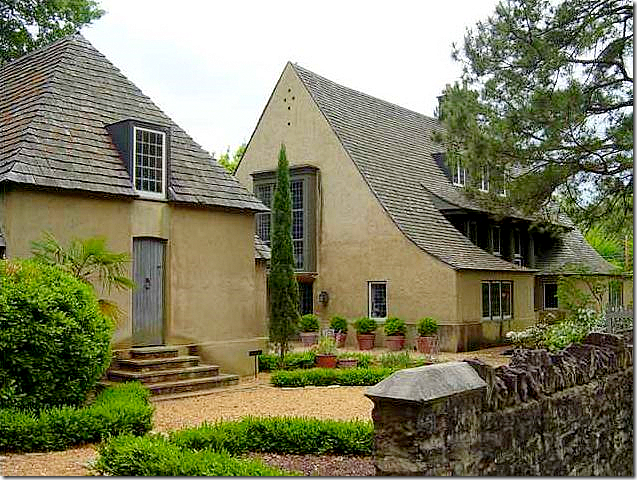 TODAY: The same view, showing the carriage house. I love the gray wood front door and the windows on the carriage house. I wonder what that room looks like upstairs?
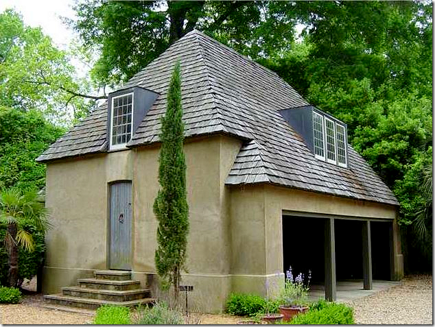 TODAY: A closeup view of the carriage house – the garage is open and faces the front door.
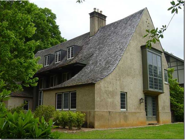 TODAY: The view from the opposite side of the house. Here you can see the two projecting wings housing the kitchen in one and the guest room in the other.


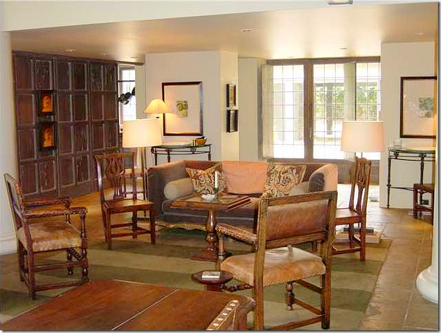
TODAY: The living area – open to the front door. The kitchen is seen to the left – right past the cypress paneled wall. Is that a walkway to the left of the front door? Perhaps it houses a guest closet? Notice that the current owners have removed all the dark paint off the walls and returned the entire house to white – as it was during Phase I and II during McAlpine’s time. And note, isn’t that the same area rug that McAlpine used during Phase III? See below:
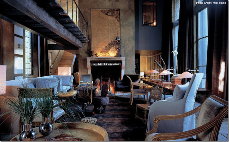
PHASE III: The Dark Phase: Here is how McAlpine left the house, with dark walls and dark curtains. The area rug certainly looks similar to what is being used today.
TODAY: The other side of the living room, shows a candle lighting fixture and a large screen, similar to what McAlpine used during Phase II – the White Phase. Maybe it’s been recovered? Notice how this family put the dining room table in the main area. McAlpine placed his dining table more towards the front door during Phase I. And the bust in the fireplace – notice that it was there during Phase III above. Is it the same bust?
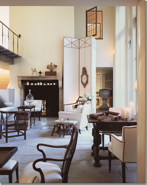
Phase II: The White Phase: The large screen – similar to what is being used today by current owners, although their screen does appear to be not as wide. I loved this phase!
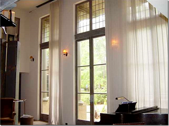
TODAY: White curtains replaced the darker ones that McAlpine used in Phase III. These sheer white curtains look more like those used during Phase I and II. I think the sconces have been also been replaced. Notice there is a piano against the tall windows.
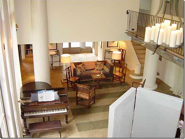
TODAY: Looking down at the living room from the upstairs window. I love the chandelier! Here you can just spy a bookcase that leads into the kitchen on the back, left. Another new detail just revealed! Isn’t this picture reminiscent of Phase I (see below?)
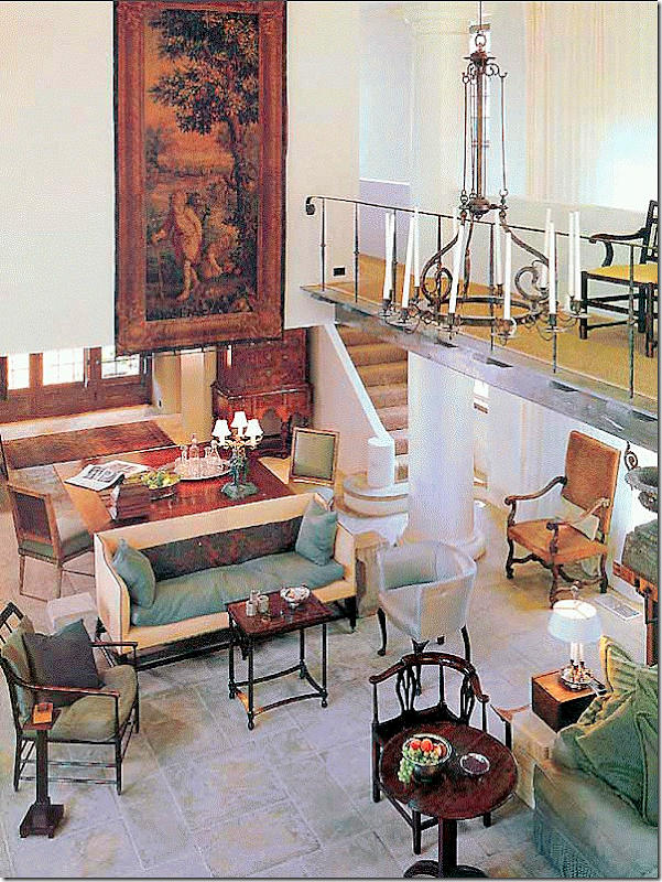
Phase I: The Green Phase: There was more color used during this first design scheme. This picture is similar to how the house looks today. Notice that McAlpine placed the dining table behind the sofa in the entry area.
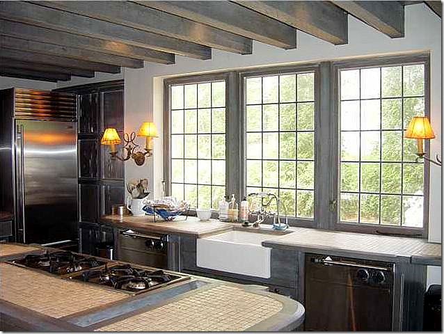 TODAY: The kitchen appears the same – except for the sconces. Here, the scones are rustic looking with cowhide shades. Also, you can see the small tiled countertop – another new detail for me.

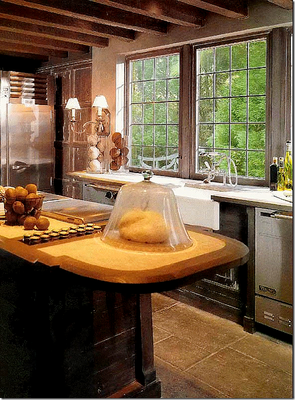 PHASE III: the Dark Phase – the sconces look more refined with a large rectangular backplate.

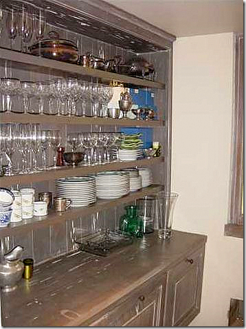 TODAY: Another new view of the house never seen before – a butler’s pantry! The current owners have kept the cypress paneling painted dark gray throughout as McAlpine left it. The cypress truly is a beautiful wood and it makes such a statement – used throughout the house, upstairs and down.
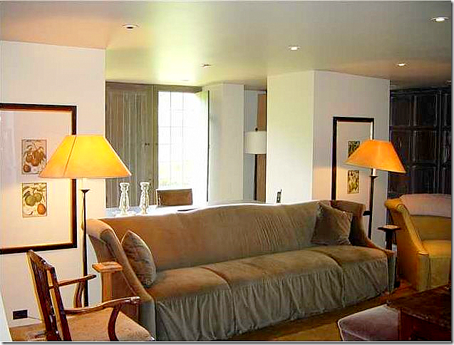 TODAY: The study located behind the fireplace has a large Bobby McApline sofa from Lee Industries. Such a gorgeous sofa!!! It’s one of my favorites in the line. This sofa is the Castle Praha #3901-03 from Lee HERE. This room looks totally different in each Phase. Here, the owners have placed a desk behind the sofa, probably to use as a small office. The family most likely watches TV in this room – right next to the former guest bedroom, located behind the cypress wall on the right.
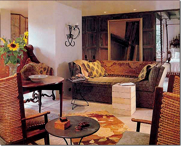 PHASE I: The Green Phase: The study is warm and cozy here, very traditional decor. You can see into the guest bedroom on the right.
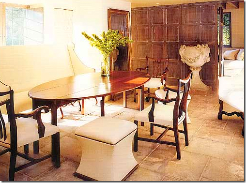 PHASE II: The White Phase. Here McApline used it as an extra dining area. The guest room is past the cypress paneling on the right.
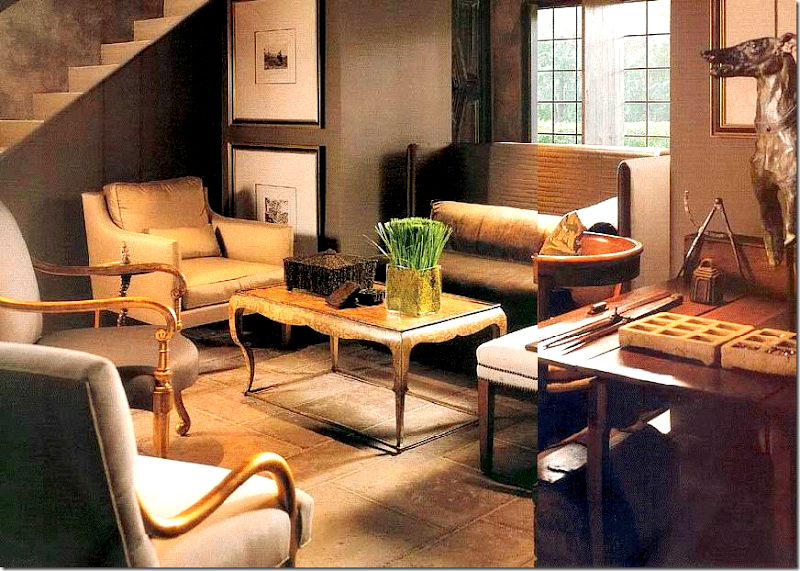
PHASE III: The Dark Phase: The most sophisticated and “decorated” phase of the house with Saladino shelter sofas and Rose Tarlow chairs. Today, these dark walls are white again.
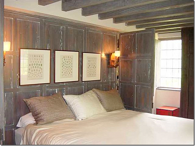 TODAY: The guest room, with its low rafter ceiling, is located off the study. McAlpine used it as a guest room, but the current owners use it as the master bedroom. Their two children use the two bedrooms upstairs. This room looks so cozy and warm – just like a centuries old English cottage! They don’t need a headboard when there is the cypress wall available instead!
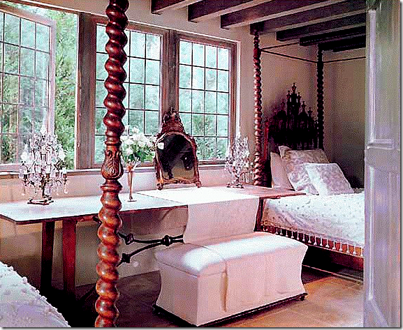 PHASE I: The Green Phase: The guest room seen here during McAlpine’s time. I love the way the room is designed here!

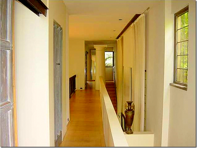
TODAY: The upstairs bridge is remarkably the same as seen during Phase I and II and III. Even the urn remains in the identical place, as do the pier glass mirrors placed at each end of the long hall.
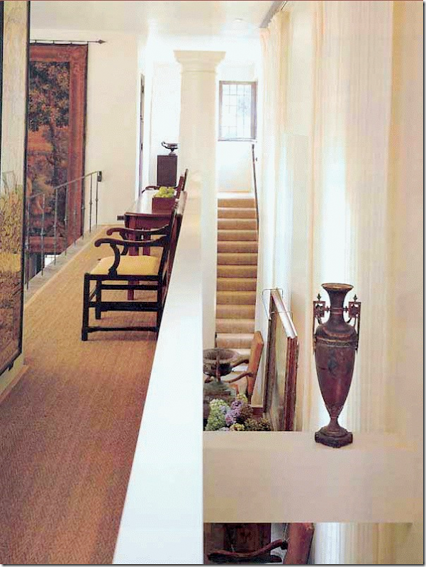
PHASE I: The Green Phase: Seagrass cover the bridge floor here – you can see the gorgeous antique tapestry, left, hanging in the living room. And there is the same vase. Do you think McAlpine forgot it on his way out – or did he gift it to the current owners, an architect in his firm? Hmmmm….. Beautiful photograph.
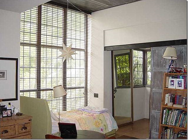 TODAY: One of the two upstairs bedrooms – I never realized the doors to the bedrooms were closed off by the cypress wood barn style door. I love the bed in front of the gorgeous window. Outside the door, the pier glass mirror in the bridge area remains.

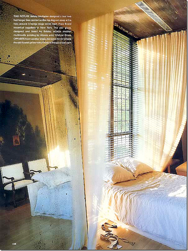
PHASE II: The White Phase. McAlpine used this second floor room as his master bedroom.
`
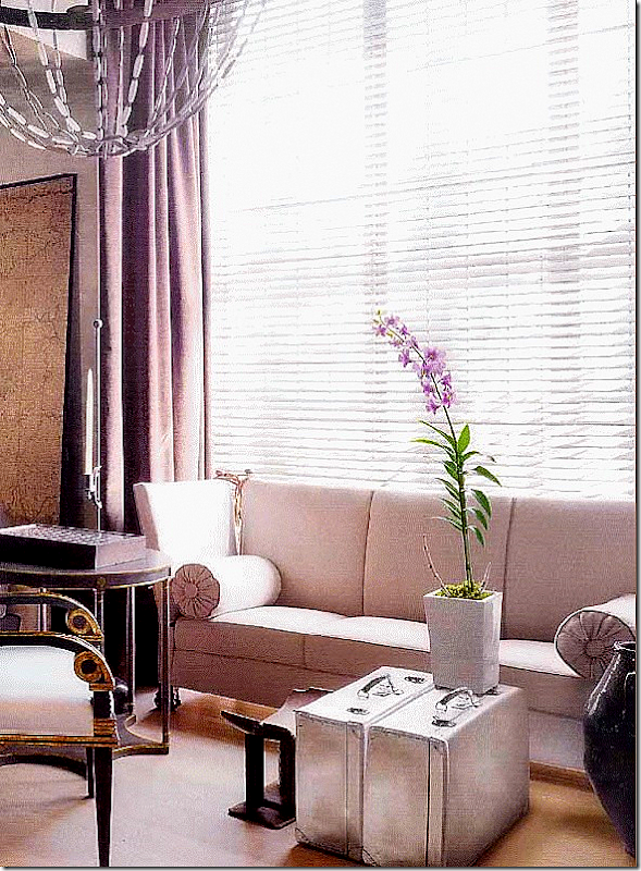
PHASE III: The Dark Phase: Here a long sofa was placed in front of the window, making the bedroom appear more like a living area.
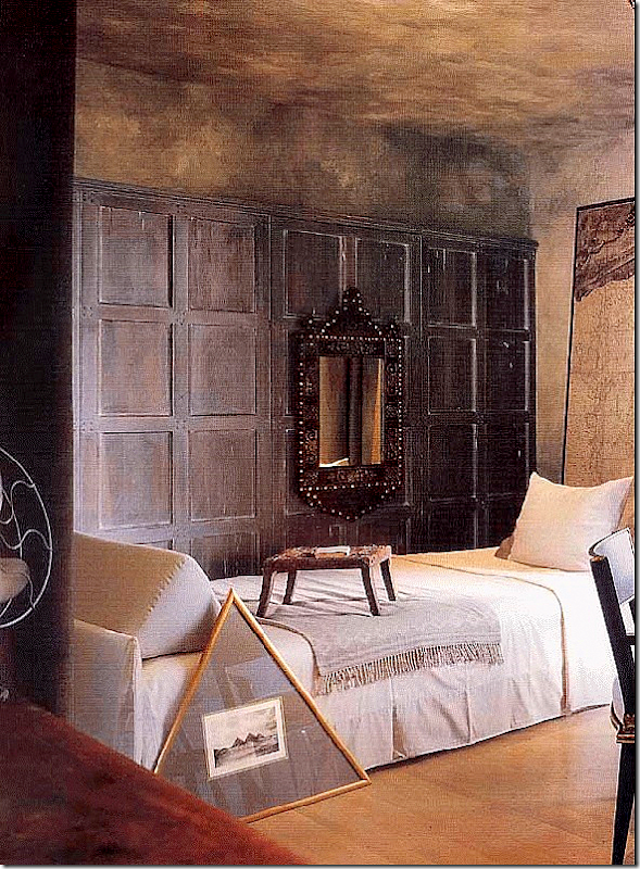 PHASE III: The Dark Phase: The same bedroom, with the bed in front of the paneling.
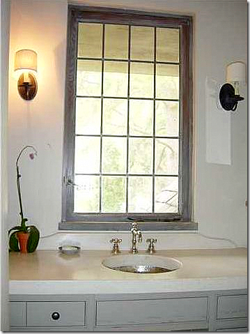 TODAY: The upstairs bathroom, with a concrete countertop and interesting hammered metal sink.
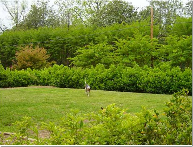 TODAY: The house sits on a large corner lot. Here is a view of the yard and another dog!
The Montgomery house has 3,757 sq. ft. and is listed HERE for….. are you ready for the price????? $499,000. A STEAL!!!!!! I am shocked at this price. Just shocked! Are you????? The house would list for at least twice that amount in Houston!!!! I am so thankful to the reader who spotted this real estate listing – especially when everyone was so interested to see how the house looked today. Amazing it is for sale now.
So, of course, curiosity got to me and I wondered whether there are any other Bobby McAlpine designed houses now for sale around the country? Of course there are! Here are a few that I saw:
For Sale: House #1:
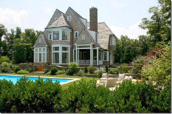
The first house for sale designed by Bobby McAlpine is located in a gated community near the Blue Ridge Mountains in Boone, North Carolina. There is a pool, stone walls, and lots and lots of room. Built in 2000, it is located on over 12 acres of land. The asking price is $2,285,000 – and that’s after a reduction of over $200,000. Here, the back side of the house overlooks the swimming pool reached by a Lutyens style wooden gate.
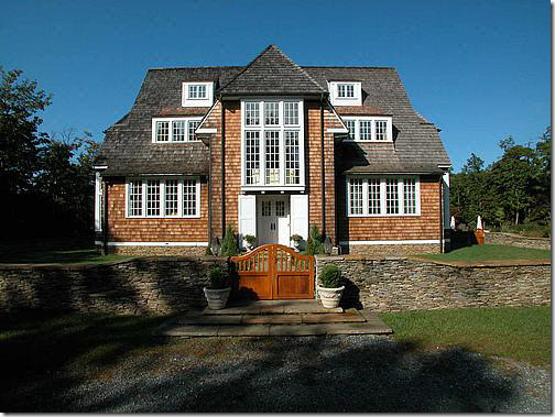 The front of the house. Somehow the entry reminds me of the Montgomery house with the tall paned windows over the shorter front door!!! Here, another Lutyens style wooden gate leads to the front courtyard. A low stone wall surrounds the house.
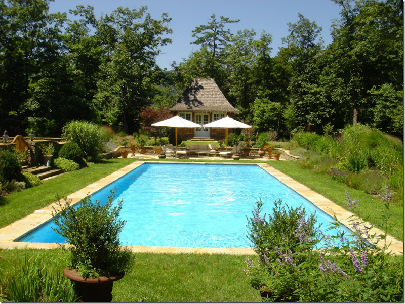 Blue Ridge Mountains: the pool house is so charming, as is the gate and stone fence on the left leading to the area.
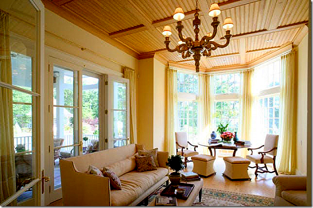 The family room overlooking the back porch is bright and airy with its wood ceiling and bay window. I love the furniture in this room! As usual, the real estate photographs of this house leave much to be desired. To see more pictures of this house, visit the listing HERE.
For Sale: House #2:
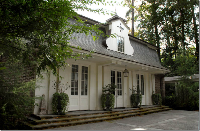
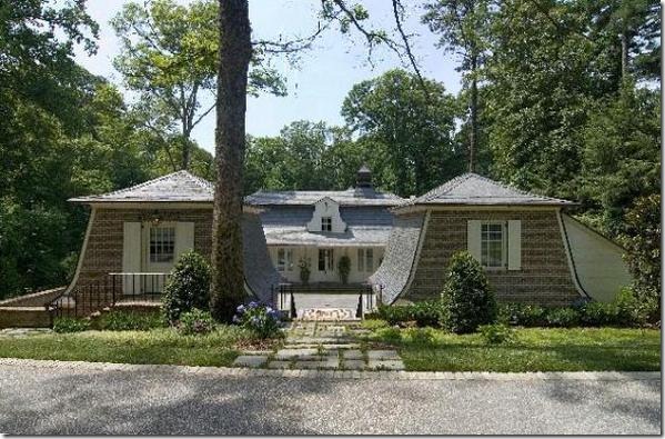 The next Bobby McAlpine designed house for sale is located in Atlanta, Georgia in Tuxedo Park. Built in 2005, it has 7 bedrooms and 7 and 2 half bathrooms. Asking price? $5,200.000. Listing is HERE. The house was built by Benecki HERE. The lot is problematic - hilly and very narrow, but deep. Here McAlpine solved the issue by placing two carriage houses located streetside. The main house is seen between the two.
The front of the house with a clock above the window! How charming!
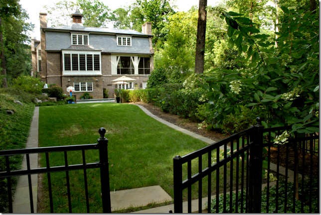 The back of the house: the yard is long and narrow and hilly which caused many design issues.
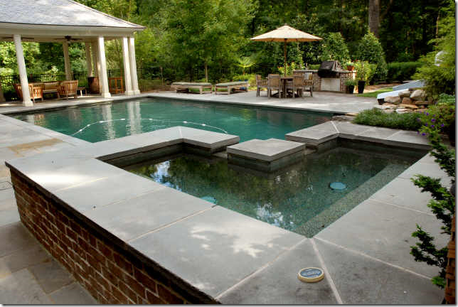 Close up of the pool and the wooded area past it.
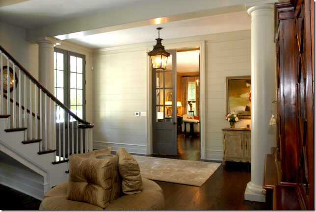
The front entry with wonderful wood walls and glass paned doors. Great lantern! The entry here becomes a room the way McAlpine has designed it.
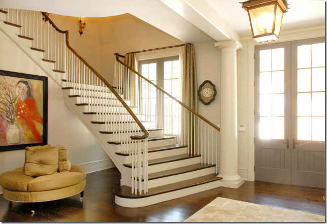
Another view of the entry showing the beautiful staircase.
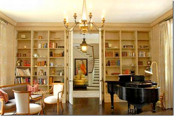 The front living room overlooking the courtyard and the carriage houses.
The house is deep and narrow. Here the kitchen is off the main hall that leads from the entry and past the dining room.
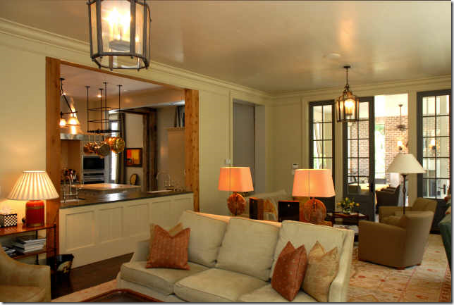 The family room, off the kitchen, leads to the upstairs porch that overlooks the back yard and the pool.
FOR RENT:
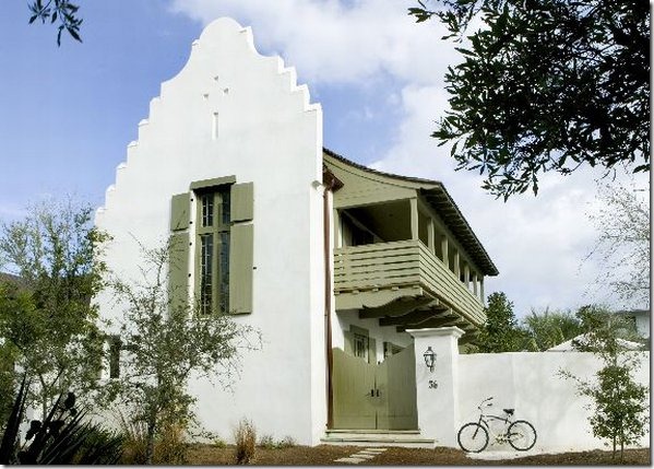
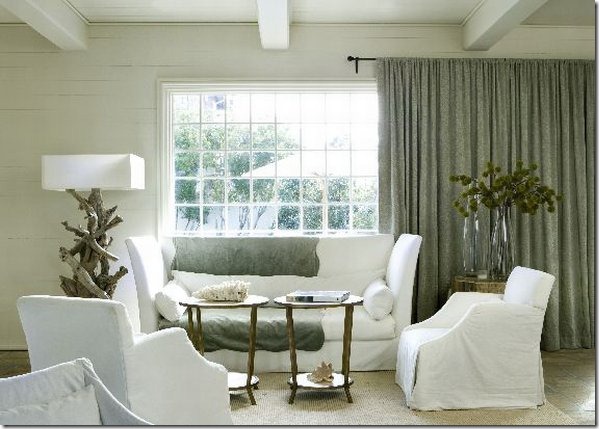
What do you do if you want to live in a McAlpine house, but are unable to? You can rent one! This beach house in Rosemary Beach Florida is available for rent. Three bedrooms, 3 1/2 baths, the house is white stucco. Here the front gate leads into the courtyard where the swimming pool is.
Built by Benecki Homes, HERE with interiors by Melanie Turner (Mrs. Benecki), this Rosemary Beach house designed by Bobby McAlpine is available for rent at $5,500 a week. Now, remember it sleeps 10 – so you can divide it up and charge every adult and child 1/10 and then it is not so expensive. I wouldn’t recommend charging children who are still in diapers, but anyone potty trained has to pay up! Personally, I’m not sure where you would fit 10 people here as there are only 3 bedrooms. The swimming pool is said to be largest in Rosemary Beach at over 20 by 40’. Several blogs have shown this beach house, but I just love it too much not to include it and what’s wrong with repeating a good thing???? For information on rentals, go HERE.

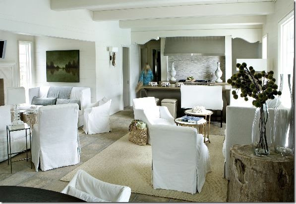
The main living area with the kitchen behind the curved wood rafters. Melanie Turner designed the interiors – all in white slipcovers. A smaller sitting area is in the alcove to the left.
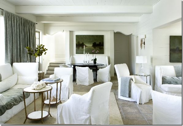
The view of the main living area from the other side. Here the stairs are located behind the curved rafters that are a mirror image of the kitchen. Tongue and groove wood walls and ceilings.
View of the main living room with the high back sofa and wonderful driftwood lamp. The courtyard lies beyond this paned window.
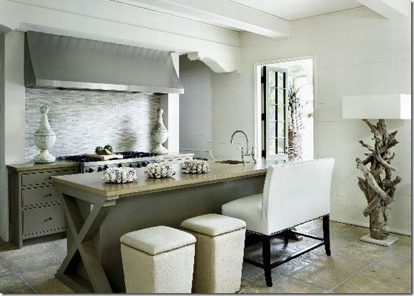
A view of the disguised kitchen. Notice the x feature at the end of the island. Just gorgeous! The door leads to the courtyard and the swimming pool.
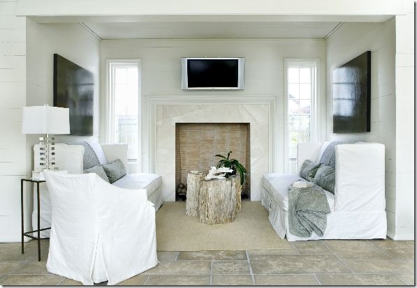
The small alcove off the main living area – two large sofas and a beautiful fireplace.
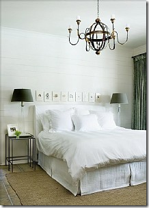 The main bedroom – designed just as the rest of the house is. I absolutely love the decor and could live in this beach house year round! McAlpine has designed more than a few houses in Rosemary Beach and surrounding areas. Be sure to look at his portfolio and press pages to see more HERE.
A HUGE thank you again to the reader who spotted the original Bobby McAlpine house for sale! Let me know if any of you buy it!!!!
AND: A reminder – the new Skirted Roundtable is up. It’s Linda, Megan and me talking about the current state of magazines. Listen HERE.



No comment for "You, Too, Can Live In A Bobby McAlpine House!"
Post a Comment